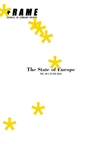
Frame 29.1 The State of Europe
date: June 2016
client: Frame | University of Utrecht
what: Journal and cover
size: 150mm x 210mm
technique: digital printing
Frame a biannual journal of literary studies, run by (former) students of Utrecht University, which publishes articles by international theorists along with important lectures, interviews, and critical reviews.
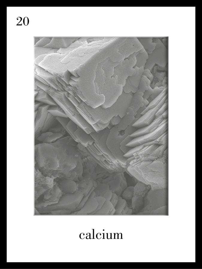
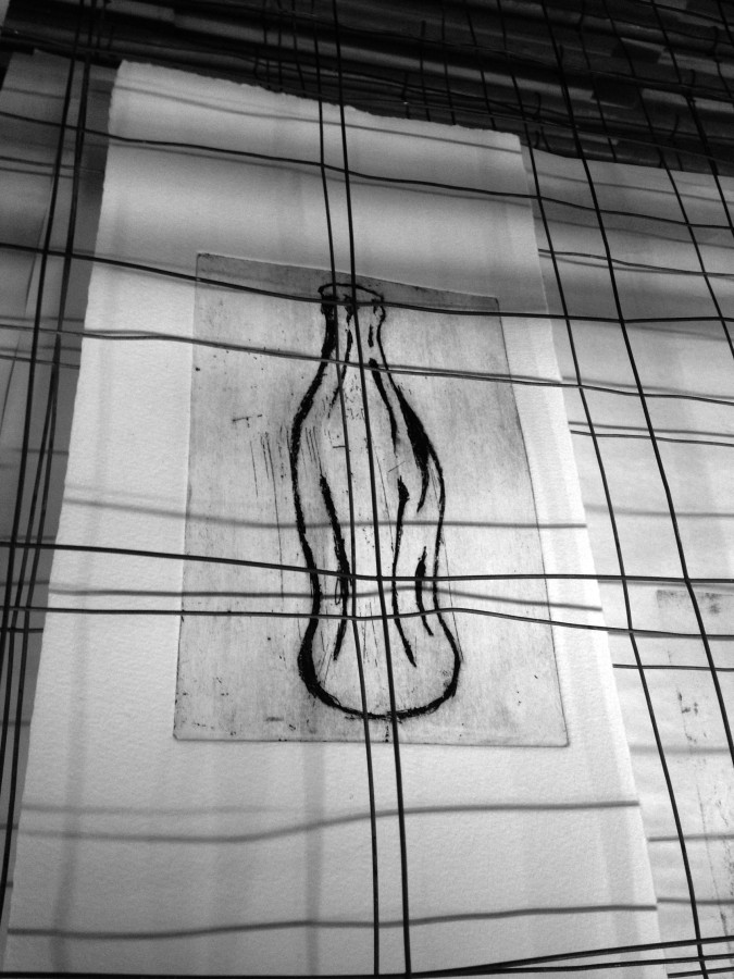
mining company − part II
date: May 2016
client: ROOS | interior architecture
what: bespoke artwork
size: 12 times 30cm x 40cm
technique: screen print and microscopic photograph
ENRC is an international leading company in the field of mining and processing elements, it’s logistics and marketing operations. Their new office at the Piet Heinkade, Amsterdam, The Netherlands, required bespoke artwork. These 12 ‘elements of mine’ gain an anatomic approach.
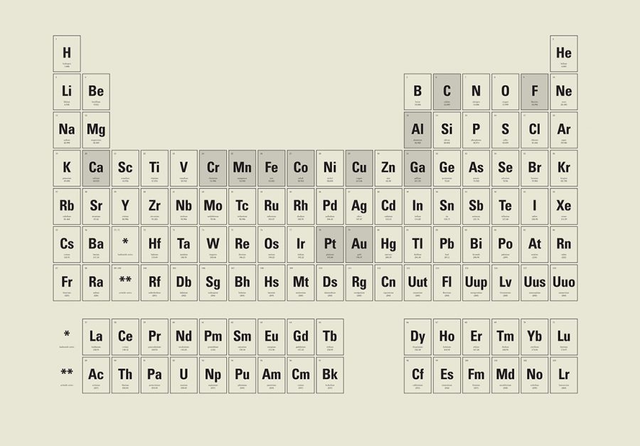
mining company − part I
date: May 2016
client: ROOS | interior architecture
what: bespoke artwork
size: ≈ 3,5m x 3m
technique: tattoo wall
ENRC is an international leading company in the field of mining and processing elements, it’s logistics and marketing operations. Their new office at the Piet Heinkade, Amsterdam, The Netherlands, required bespoke artwork. This periodic table of elements displays their commercial.

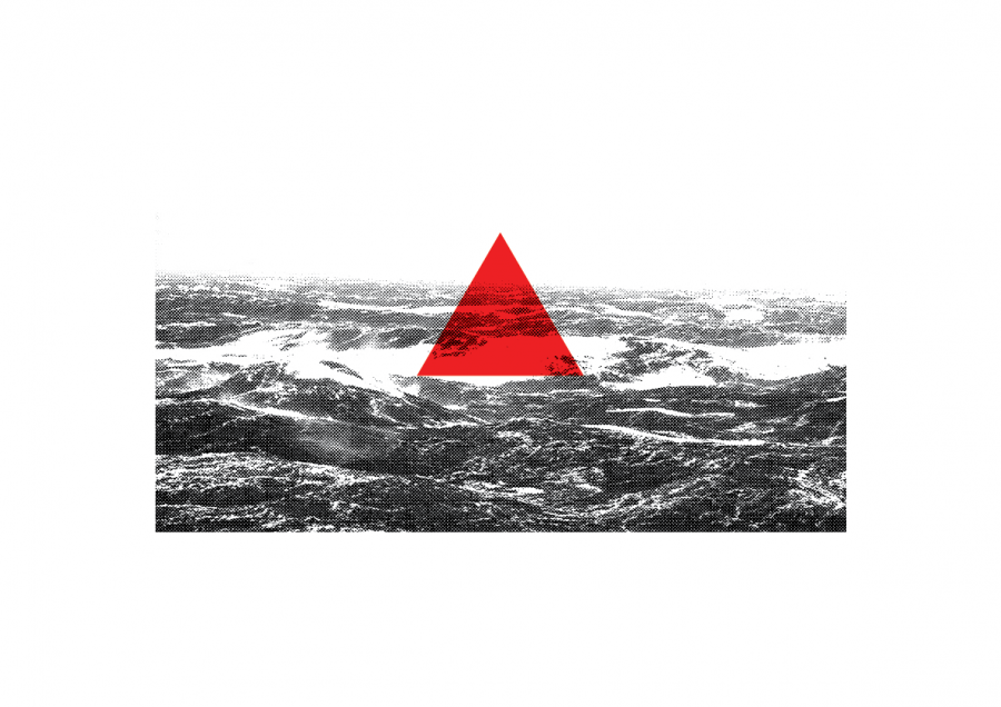
LIDL
date: May 2016
client: ROOS | interior architecture
what: window graphics
size: ≈ 10m x 2,5m
technique: mat window film on glass
The office design of a new distribution centre of LIDL in Waddinxveen, The Netherlands, is performed by ROOS | interior architecture. By using a triangle — the simplest form to represent direction — we emphasize the distribution factor.
Frame 28.2 The Postcolonial Cultural Industry
date: June 2015
client: Frame | University of Utrecht
what: Journal and cover
size: 150mm x 210mm
technique: digital printing
Frame a biannual journal of literary studies, run by (former) students of Utrecht University, which publishes articles by international theorists along with important lectures, interviews, and critical reviews.
JOSJE
date: July 2015
client: Louis Hartlooper Complex
what: logo/brand
size: varies
technique: varies
Josje Blond is a hoppy, tropical, blonde ale beer brewed (by brewery Maximus) as a surprise for filmmaker and theater entrepreneur Jos Stelling on his 70th birthday.
Frame 28.1 Writing the Self
date: May 2015
client: Frame | University of Utrecht
what: Journal and cover
size: 150mm x 210mm
technique: digital printing
Frame a biannual journal of literary studies, run by (former) students of Utrecht University, which publishes articles by international theorists along with important lectures, interviews, and critical reviews.
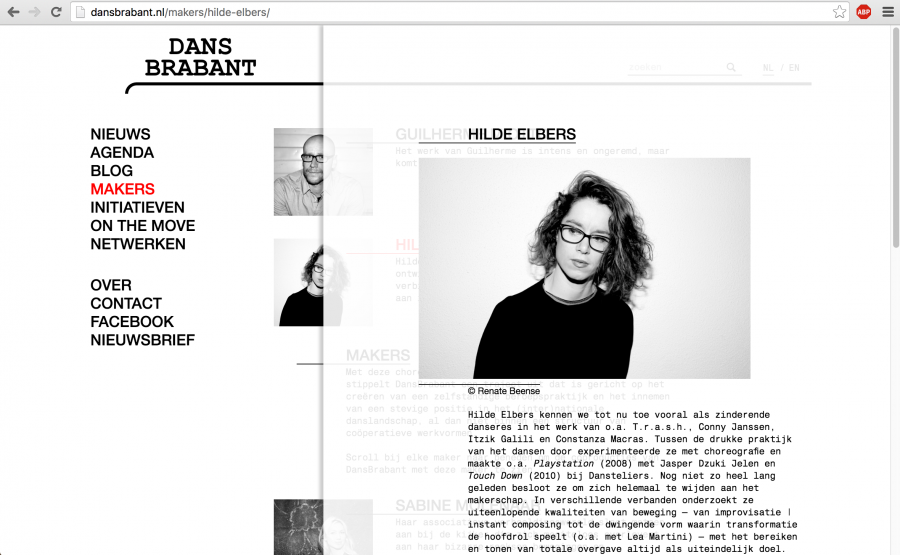
website DansBrabant
date: April 2015
client: DansBrabant
what: webiste design
DansBrabant is a nationally and internationally oriented stimulator and catalyst in the fields of dance and choreography. Based in Tilburg, the Netherland.
Implementation by Studio Zijspan.
Frame 27.2 Racism in the Netherlands
date: November 2014
client: Frame | University of Utrecht
what: Journal and cover
size: 150mm x 210mm
technique: digital printing
Frame a biannual journal of literary studies, run by (former) students of Utrecht University, which publishes articles by international theorists along with important lectures, interviews, and critical reviews.
DETOUR BOOTH
date: August 2014
client: DansBrabant
what: brochure
size: ∅ 600mm
material: ink with glas/sticker/metal/reel
Düsseldorf, our booth is ready!
DETOUR BROCHURE
date: August 2014
client: DansBrabant
what: brochure
size: 120mm x 210mm
technique: offset
DansBrabant, a promotor for young dancers and choreographers, asked me to develop a brochure, and design their exhibition booth for the biennial International Tanzmesse 2014 at Düsseldorf. Click on the picture above to view more of the brochure.
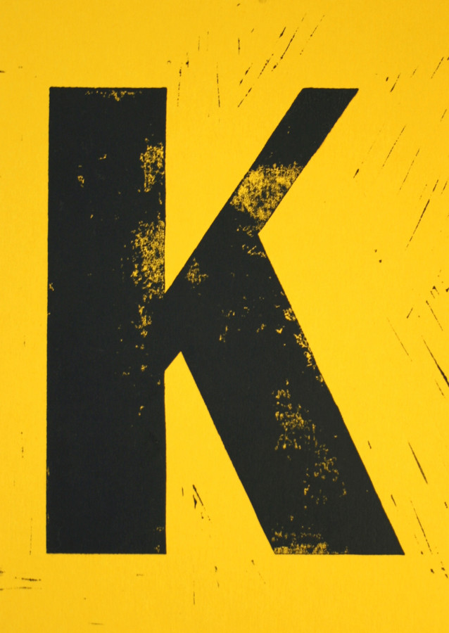
Kunst aan Tafel
date: June 2014
client: Springhaver Theater Café
what: flyer
size: 148mm x 210mm
technique: linocut
‘kunst aan tafel’ is a bimonthly exhibition of text, signs and/or image. Different artists’ work is exhibited for visitors to see. This exhibition takes place at Springhaver Theater Café. Every artist gets his own ‘K’ flyer that suits his/her work.
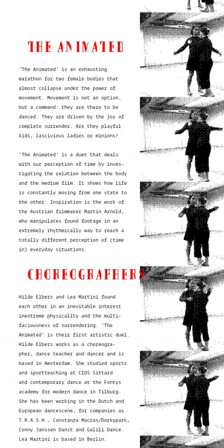
the Animated
date: March 2014
client: Hilde Elbers
what: flipbook/flyer
size: 100mm x 50mm/100mm x 200mm
technique: digital printing
‘The Animated’ is a dance performance from Hilde Elbers and Lea Martini. Their inspiration came from the work of Austrian artist/filmmaker Martin Arnhold, who works with — and manipulates — found footage.
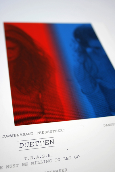
duetten
date: August 2013
client: DansBrabant
what: poster/flyer
size: 420mm x 598mm/148mm x 210mm
technique: screen print and offset
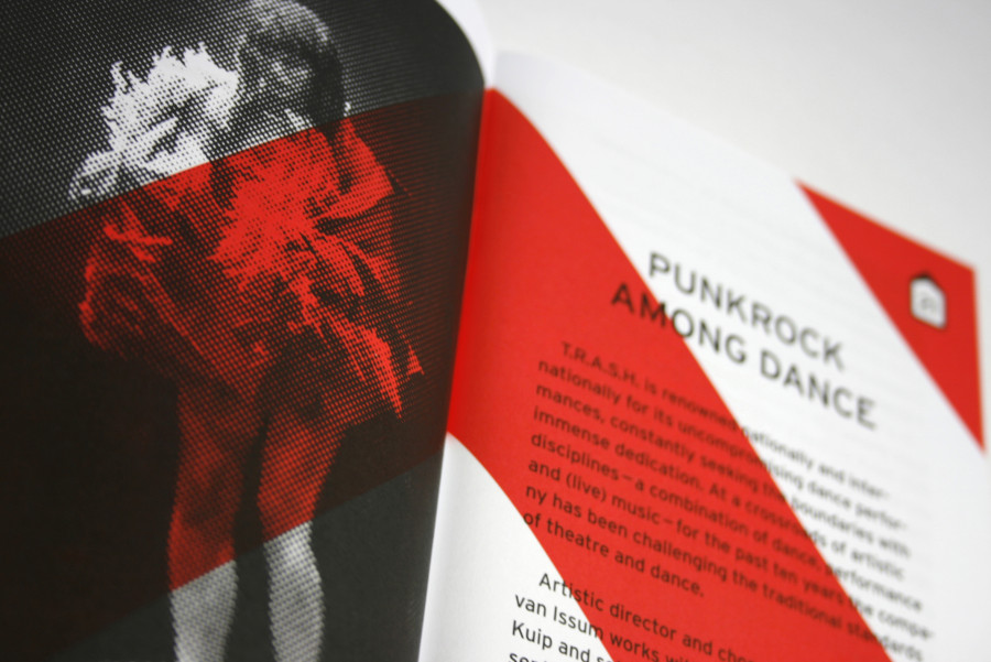
During Festival Boulevard, DansBrabant presented a dance program called duetten. The participating dance-groups were T.R.A.S.H., Arno Schuitemaker and United-C. Because I screen printed the posters myself, and the flyers were to be printed in offset, printing house Pascal B.V. was kind enough to let me stand at their press to determine when the colours were right. A great experience!
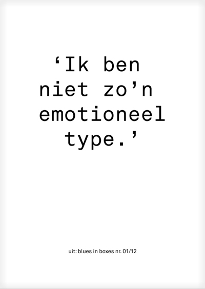
blues, blues, blues
date: August 2012
client: De zon schijnt niet in uw TV
what: poster/flyer
size: 105mm x 148mm/420mm x 594mm
technique: offset/silkscreen
Concept and text: Anna van der Kruis
Play: Mik van Goor
Music and songtext: Mathijs Leeuwis
![RUIGE MEST [verse dans #4] e-flyer 2](http://elsevanwulfftenpalthe.nl/wp-content/uploads/2014/10/RUIGE-MEST-verse-dans-4-e-flyer-2.jpg)
ruige mest
date: October 2012
what: hand-out for a dance program
size: 148mm x 210mm
technique: offset
The Productiehuis Brabant arranged a dance program. The program contains previews, presentations, fragments and readings of the work of several choreographers. For this arrangement I designed their
hand-out which was given to the audience at the cash register.
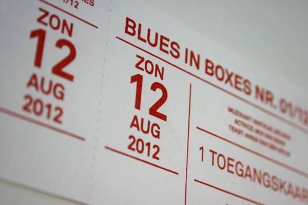
blues in boxes no. 01/12 ticket
date: August 2012
client: De zon schijnt niet in uw TV
what: theaterticket for ‘blues in boxes’ no. 01/12
size: 60mm x 120mm
technique: risograph
Here they are… the tickets for the first ‘blues in boxes’ of twelve.
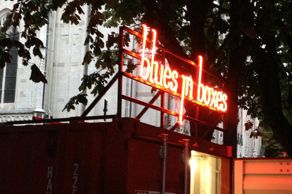
blues in boxes neon sign
date: June 2012
client: De zon schijnt niet in uw TV
what: neon sign for ‘blues in boxes’
size: 2.0m x 0,89m
technique: neon (noble gas)/metal
‘blues in boxes’ is a concept of playwright Anna van der Kruis. She is working on 12 short plays about blues in our everyday life. The plays are to be shown in containers over a time period of roughly nine years. This August at Theaterfestival Boulevard ‘blues in boxes no. 01/12’.
ik voel me veiliger als jij dáár staat
date: June 2012
client: Peerke Malschaert
what: poster
size: 605mm x 246mm
technique: silkscreen
The poster was designed for the performance Ik voel me veiliger als jij dáár staat, made by director Peerke van Malschaert in collaboration with musician Roald Oosten.
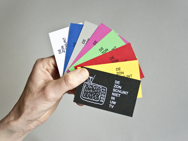
De zon schijnt niet in uw tv
date: August 2011
client: De zon schijnt niet in uw TV
what: buisiness card
size: 85mm x 55 mm
technique: silk screen
De zon schijnt niet in uw TV is a theater collective of changing members, around founder and playwright Anna van der Kruis. The collective presents theater intersecting the written word and mime.
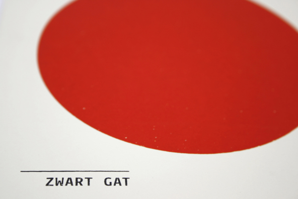
zwart gat
date: December 2010
what: poster/flyer for the exhibition ‘zwart gat’
size: 500mm x 500mm/150mm x 150mm
technique: silk screen
In 2010 I organized an exhibition, in collaboration with Kim de Haas and Manon Rugge, which contained graduation work of late HKU alumni of August 2010. After graduation we all get to deal with the principal ‘black hole’, and the big question: ‘Now what?’. We used the ‘black hole’ to our advantage.